Complementary Colors within Interior Decorating
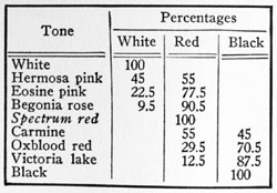
Each hue thus formed by the mixture of two primaries, in whatever proportions, will have the same intensity as the primaries themselves; and since these pure colors are intolerable except in the smallest areas, we must in color work change their character by adding black, white or grey, or by neutralization through the use of complementaries. Thus, by adding a little black to each color in the chromatic circle we obtain a new circle of colors, slightly darker and duller than the original hues. By adding a little more black we obtain a second circle, still darker and more dull; and this process can be continued until the amount of black in the mixture renders the original hues practically indistinguishable. Another series can be produced by adding white in progressively increasing quantities to the spectrum hues, up to the point where the original colors become the palest of tints and practically indistinguishable, like the colors on the inside of a shell. Chevreul, in the color plates included in Des Couleurs, makes the change by regular ten per cent. Increases in the quantity of black or white. Ridgeway gives a typical eight interval scale, starting with spectrum red and ranging downward to black and upward to white:
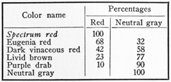
In addition to these scales produced by the addition of varying quantities of black or white to the spectrum hues, we can produce new colors by adding to each of the spectrum hues definite and increasing amounts of neutral grey, the effect of these additions being, not to make the colors increasingly darker or lighter, but rather to make them increasingly less pure and more greyish. The table below, which, together with the one that follows, is also taken from Ridgeways work, illustrates the process as applied to spectrum red:
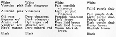
Using any one of these greyed-out variants of the spectrum hues as a base we can in turn construct a new scale ranging in value from black upward to white:
If we take a considerable quantity of orange cadmium paint and add to it a very small amount of ultramarine blue, the orange will immediately lose a little of its purity and become slightly more greyish, and it will continue to grow progressively less orange and more grey as the amount of blue in the mixture is progressively increased, until finally all trace of orange disappears and nothing remains but a neutral grey. Any two hues which thus complete each other in the production of neutral grey are called complementary colors. In the chromatic circle each one of a pair of complementaries lies directly opposite the other, since each is made up of a hue or hues which have no part in the composition of the other.
It is obvious that a pair of complementary colors will neutralize each other completely-that is, they will unite to form a colorless grey-only when they are mixed in a certain proportion, and that when they are mixed in any other proportion the result will not be a neutral grey, but a more or less greyish tone of the hue which is in excess in the mixture. An unlimited variation in these stages of neutralization is therefore possible, but for the sake of clearness three stages are ordinarily recognized in decorative practice. Thus we speak of full intensity colors, and of colors of three-fourth, one half and one-fourth intensity. The resulting colors are in intensity the same as would be produced by the addition to the spectrum hues of one, two, and three parts of neutral grey. Thus the pure scarlet of the spectrum becomes, when reduced to three-fourths intensity, coral red. When reduced to one-half intensity it becomes Etruscan red; while at one-fourth intensity it is a deep brownish mauve.
It is clear from the preceding discussion that the colors differ from each other n several ways, and that to speak of a color as red, or blue, or violet is to communicate to the mind of the auditor a very incomplete and inaccurate idea of the real nature of the color. In fact a color, in order to be accurately characterized, must be described in terms of three different attributes, called the color constants. These constants are hue, purity or intensity, and luminosity or value.
 "Finally! Step-by-Step Guidebooks Show