Complementary of a Room
The amount of the complementary introduced into a room may vary anywhere from slight accents up to a third or even more of all the colored surfaces of the room. When there is only a little of it the harmony remains one of analogy, set off by touches of its complementary; when there is a lot of it the harmony becomes one of complementaries, or contrast. In harmonies of this kind, two important colors only are employed, although small accents of other hues will of course be introduced into the room. Complementary harmonies are relatively easy to produce, and may be varied easily and safely from simplicity to relative complexity to accord with personal feeling and the decorative or emotional requirements of the room. They are less subtle and less restful than harmonies of analogy, but more animated and more brilliant. Moreover, since a pair of complementary colors are necessarily unlike emotionally-if one is warm and exhilarating the other is cool and tranquillizing-harmonies of this type are incapable of expressing the temperamental idea.
The real difficulty in the creation of these harmonies is to fix upon the complementary of the dominant hue. In the chapter on color it was pointed out that there is a difference between the scientific facts of color and the working explanation of color phenomena formulated by Chev-reul and generally adopted by artists and color workers, and, for the sake of simplicity and helpfulness in practice, adopted also in this study. At this point, however, even at the risk of some confusion in thought, it seems desirable to introduce the color chart, published in Von Bezold's Theory of Color, in which the true scientific complementaries are indicated by straight lines drawn from any point on its circumference through the center of the circle. The opposing pairs of colors thus obtained are true complementaries because each pair, when mixed as colored lights, yields white light. Nevertheless, color workers have found that in practice true complementaries for the most part make disagreeable contrasts, and that these contrasts are far more agreeable esthetically when the opposing colors are placed a little nearer together on the warm side of the scale. Thus vermilion red is more pleasant with green than with cyan, or blue-green; orange is more agreeable with ultra-marine than with turquoise or greenish-blue; and yellow is more pleasant with violet than with blue. For this reason we are warranted in accepting as complementaries the pairs opposed to each other in Figure 45.
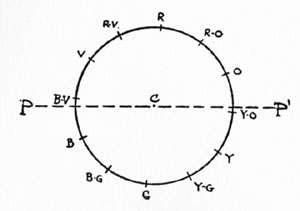
FIGURE 45.- The straight line P-P, rotating on C as a pivot, indicates the pairs of pigmental complementaries.
It appears from the study of Von Bezold's chart, how- ever, that between violet, purple and red there are differences far greater than those between their scientific complementaries - a circumstance that makes the use of green in complementary harmonies very difficult. Neither painters nor decorators have used this harmony to any great extent, probably because of this difficulty, and it is a safe rule of practice to confine the use of green to harmonies of analogy or to the triads. Contrasting harmonies of yellow-green and purple, yellow and violet, yellow-orange and violet-blue, and orange and blue are much easier to manage.
FIGURE 46.- A free adaptation of Von Bezolds chart. Colors lying on opposite sides of the center are accurately complementary.
The triads or trichromatic harmonies are based upon arrangements of any three hues that are equidistant and therefore lie at the points of an equilateral triangle inscribed within the chromatic circle; as, for example, red, blue and yellow. If one member of a triad is changed in hue to right or left each of the other two members will normally be changed equally in the same direction. Thus we may have triads in red, blue and yellow; red-orange, yellow green and blue-violet; orange, green and violet; or yellow-orange, blue-green and red-violet. In addition to these triads others may be devised by skilled colorists by slightly altering one or two of the hues, as in the case of purple-red, yellow and cyan-blue, or vermilion, dark greenish- yellow (olive) and violet-blue-a triad much used in several of the Italian schools of painting. White or gray can be used effectively with most of the triads, and particularly with orange, green and violet, and purple-red, yellow and cyan-blue; while in all of the triads small-interval changes of hue and the introduction of small accents of additional hues are permissible.
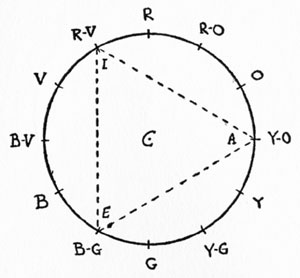
FIGURE 47.- The triangle AEI, rotating on C as a center, indicates typical triads or trichromatic harmonies.
 "Finally! Step-by-Step Guidebooks Show