Individual Feeling
While it is clearly impossible to formulate rules for the employment of contrast in decorative practice, because its use, like everything else in the art, must be governed by the requirements of fitness and by the dictates of individual feeling, a few considerations ought always to be borne in mind by the decorator. In general it must be remembered that contrast, whether of color, form or texture, is esthetically pleasing simply because it relieves the mind from the sense of too much likeness, or harmony, just as occasional changes in tempo, rhythm or force in music relieve the mind and add interest and charm. But in decoration, as in music, whenever the number of elements introduced for contrast becomes so great, or their opposition so sharp, that the mind fails to perceive without effort the predominant likenesses or unity of the composition its beauty is impaired or destroyed. Hence the number of such contrasts must in any case be limited. Moreover, contrast means a sense of activity; and while there must be some activity everywhere except in death, the amount of it desirable in a room to be occupied day in and day out is less than might be supposed. It will vary, of course, with the purpose of the room and the tastes, pursuits and health of the people who use the room, and with the size of the room itself. Activity always requires a clear space. Hence a degree and intensity of contrast agreeable in a large room would be intolerable in a small one.
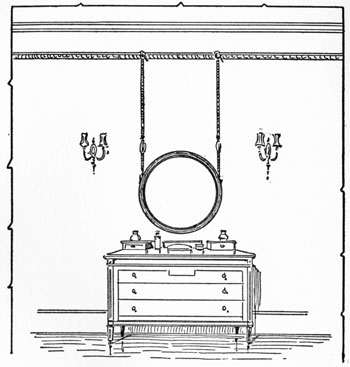
FIGURE 22.- dresser and mirror in sharp contrast. Note that a circular mirror is unpleasant when hung with two vertical cords. See Figure 40
However, the primary consideration must always be the motive or emotional significance of the decorative scheme. We have seen that the repose and tranquillity of a room vary directly with the emphasis placed upon the unity in its treatment, while its effect of cheerfulness and animation varies directly with the emphasis placed upon diversity. Thus relative uniformity, either in color or in outline, tends to emphasize the tranquillity, seriousness and dignity of a room, and this effect is enhanced by convergence of both color and outline; while relative absence of uniformity, as it results from the free employment of contrast, tends to emphasize the effect of gayety and animation. Few contrasts, and those of minimum intensity, give to a decorative treatment an effect of quiet and softness; while sharp contrasts tend to produce a powerful effect, in direct pro- portion to the size of the contrasting masses and the degree of their unlikeness. Sir Joshua Reynolds pointed out that the style of painting in which strong colors are opposed to one another in large masses is grander and more striking than one in which the colors are used in more nearly uniform intensity, or smaller areas, and tenderly blended; and the same differences obviously result from varying degrees of emphasis in contrasts of shapes and sizes.
In practice the mere fact of contrast is very much less important than the intensity of the contrast, and this is particularly true of color. Red and green of one-fourth intensity or less form a contrast agreeable in large areas; red and green of spectral purity would be intolerable in any except minute quantities. Colors may be contrasted in hue, purity, or tone, or in any two or all three of these constants simultaneously. One of these elements is sufficient for many contrasts, and for practical purposes two constitute the limit. Thus a blue and gold damask offers a contrast in both hue and tone. To make a difference in the purity of the hues would be altogether too much.
When contrast is employed purely for accent, or to give snap to the room, the decorator must be governed by the fact that every sharp contrast is in effect a royal invitation to the eye, which is bound by its nature to attend to a powerful stimulus. Accordingly he must first of all see to it that the element thrown into prominence by the contrast is in itself beautiful, or at least interesting, since to force into an unnecessary prominence an object or material intrinsically ugly or commonplace would be worse than folly. An ill-designed embroidered sofa cushion, for example, will remain fairly inoffensive if it is in the same color or tone as the sofa covering; but when an ugly light cushion is placed against a dark background, or when an ugly cushion of any tone is placed against its complementary hue, all its ugliness is brought out for all the world to see. Similarly a bad picture or an ill-looking carved chair will be more noticeable against a plain wall than against one covered with an inconspicuous all-over design, and its visible ugliness will increase directly with the degree of contrast, in hue, tone and texture, between the object and its background.
Moreover, the decorator must see to it that the point of sharpest contrast coincides with the point of greatest decorative interest. A spirited picture, for example, will have its decorative importance enhanced by contrast with the wall. But if the picture be mounted on a very light mat and hung against a relatively dark wall the point of sharpest contrast will lie at the juncture of the wall and mat surfaces, and the decorative value of the picture will be diminished if not entirely lost. Finally, the contrasting element must be so placed as to satisfy the sense of balance. This matter is comparatively unimportant when the contrasting element is itself small and unimportant-as, for example, when a little purple vase is placed on a small satinwood table; but in the degree that the element is large or decoratively important it must be placed in a carefully balanced relation to the background. Her Grace may wear a mouche anywhere from her eye to her chin, but her coronet must go on Straight.
In conclusion we may note that here as everywhere in decoration wisdom lies in moderation. Contrast loses all its pleasantness and stimulating quality when used too freely. Too many elements introduced for contrast, and too sharp differences among them, will destroy the repose and mar the beauty of any room. And while the amount and the intensity of contrast is properly very largely a matter of individual feeling, it is certainly true of the individual, as of the race and the epoch, that the more highly one's taste is cultivated the less one welcomes strong contrasts.
 "Finally! Step-by-Step Guidebooks Show